

How to Choose the Perfect Background for Authentic Corporate Photos

There is a silent problem that affects many companies in Palma de Mallorca: their corporate portraits look too similar to each other. The neutral gray background, the white office wall, the artificial bokeh without context. These choices, made out of convenience or imitation, end up diluting what should be a company's most powerful asset: the identity of its people. Choosing the right background is not a minor detail. It is the decision that separates a photograph that generates trust from an image that goes unnoticed. In this article, I guide you, step by step, to make that decision with artistic and strategic criteria.
Table of Contents
- How to define the intention and message of the corporate portrait
- Tools and materials for background selection: what do you need?
- Step-by-step process to select the background according to communicative intent
- How to check results and avoid generic backgrounds: practical examples
- Our vision on background selection in corporate portraits
- Discover solutions for corporate portraits in Palma
- Frequently asked questions
Key Points
| Point | Details |
|---|---|
| Define message and objective | Aligning the background with the purpose and brand identity avoids generic results. |
| Essential tools | Using briefs, visual references, and background samples is key to making the right choice. |
| Structured process | Following defined steps ensures a creative and relevant background selection. |
| Final check | Verify that the background adds authenticity and credibility through evaluation and feedback. |
How to define the intention and message of the corporate portrait
Before thinking about colors, textures, or locations, you need to answer a more fundamental question: what do you want the viewer of this photograph to feel? This seemingly simple question is often the most overlooked in corporate assignments. And it is precisely where problems begin.
The first thing I recommend is to review the current portraits of your company or team. Look at them with critical distance. Could you swap those backgrounds with those of another company in the sector without anyone noticing? If the answer is yes, you are facing a visual cliché. Generic backgrounds are not neutral: they communicate indifference, a lack of identity, and, in many cases, a disconnection between the person portrayed and the brand they represent.
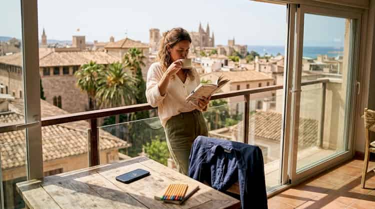
There is an important difference between a studio portrait and a portrait in a work environment. The former offers total control over light and background, allowing for a very precise construction of the image and message you want to convey. The latter provides real context, authenticity, and a visual narrative that connects the person with their everyday work. Neither is superior to the other: the choice depends on the message you need to project.
To define that message clearly, I propose working with a photographic brief. This document does not have to be lengthy, but it should be precise. It should include:
- The professional role of the person portrayed and how they want to be perceived
- The values of the company that should be reflected in the image
- The channel where the photograph will be published (LinkedIn, corporate website, press)
- The desired emotional tone: close, authoritative, creative, technical
Analyzing current portraits and defining key messages avoids generic results and allows each image to have a reason for being. When the brief is well constructed, the background ceases to be an aesthetic choice and becomes a narrative tool.
The identity in corporate portraits is not built solely with clothing or facial expression. The background speaks before the viewer processes any other element of the image.
Professional tip: Gather between five and ten visual references of corporate photographs that you admire, even if they are from sectors different from yours. Analyze what these backgrounds have in common: are they dark or light? Do they have texture or are they smooth? Do they show context or are they abstract? This practice will give you a concrete visual vocabulary to communicate exactly what you are looking for to the photographer and will avoid ambiguous interpretations that lead to mediocre results.
Tools and materials for background selection: what do you need?
Once you are clear about the message you want to convey, you need the right tools to translate it into concrete decisions. Many professionals arrive at a photo session without having prepared anything beyond the clothing they will wear. This is a mistake that pays off in results.
The essential tools for choosing the background with criteria are as follows:
- Brand brief: The document that defines values, corporate color palette, tone, and usage channels. If your company has one, bring it to the session. If not, now is the time to create it.
- Visual moodboard: A selection of reference images that communicate the desired style. It can be created on Pinterest, Milanote, or simply in a photo folder. The important thing is that it is specific, not generic.
- Background samples: If the session is in a studio, ask the photographer to show you physical options of available backgrounds. Colors change significantly with lighting, and what appears as an elegant gray on screen may turn into a dull beige under certain lights.
- Environmental guide: If the session is outdoors or in the office, visit the space beforehand and photograph the walls, windows, and areas with the best natural light. This allows for informed decisions before the session day.
Including an environmental guide and visual references is essential to translate brand identity into the final image. Without these materials, the photographer works blindly and you rely on luck.
The following table summarizes the most common types of backgrounds and their ideal applications, so you can guide your decision based on the context:
| Type of background | Best for | Visual effect | Recommended channel |
|---|---|---|---|
| Neutral plain (gray, white) | LinkedIn profiles, directories | Clean, professional | Corporate website, press |
| Textured (wood, concrete) | Creatives, architects, designers | Warm, artisanal | Social media, portfolio |
| Real working environment | Executives, technical teams | Authentic, contextual | Reports, media |
| Urban or natural outdoor | Personal branding, entrepreneurs | Dynamic, accessible | Instagram, LinkedIn |
| Dark dramatic background | Leadership, conferences, luxury | Striking, elegant | Covers, presentations |
Corporate photography in Mallorca offers a remarkable geographical advantage: the Mediterranean light and variety of environments, from the historic center of Palma to converted industrial spaces, greatly expand the possibilities for authentic and unique backgrounds.
Understanding the key elements in artistic portraits helps you understand why the background is not an accessory but rather a structural component of the image. The texture, color, and depth of the background interact with the lighting and the subject's expression to create a complete visual narrative.

Step-by-step process for selecting the background according to the communicative intention
With the materials prepared, the selection process can follow a logical sequence that eliminates improvisation and significantly reduces the risk of ending up with a background that conveys nothing.
Review of the brief and objectives. Go back to the photographic brief and read the values and emotional tone you defined. Ask yourself: does this background reinforce those values or contradict them? A corporate lawyer aiming to project solidity and trust should not appear in front of a wall with graffiti, even if it is trendy on social media. The coherence between message and visual context is non-negotiable.
Initial selection of background according to brand identity. Using the moodboard and the corporate color palette, select two or three background options that could work. Do not settle for just one from the start: the visual comparison between options reveals nuances that are not evident when analyzing each one separately. Aligning the background with the objective and the brief is the step that humanizes the portrait and differentiates it from a stock image.
Visual testing and adaptation to the environment. Before the final session, conduct photo tests with the planned lighting. A background that works with natural light may lose all its strength under artificial lighting. This test also helps to detect if the background visually competes with the subject, which often happens with very saturated backgrounds or complex patterns.
Validation with an artistic reference and feedback. Show the tests to someone with visual judgment, whether it's the photographer, an art director, or a colleague with aesthetic sensitivity. Ask them what they feel when they see the image, not what they think. Emotional responses are more revealing than rational judgments when it comes to photography.
Professional photography services usually include a pre-production phase where these decisions are made collaboratively. If your photographer does not offer you this process, it is a sign that they may not be working with the level of customization that your image deserves.
Personal branding photography in Palma follows exactly this methodology: each session begins with a consultation where the message is defined, backgrounds are selected, and the visual narrative is planned before shooting a single photo.
Professional tip: Avoid backgrounds that do not provide either emotion or relevant context. A background that "does not bother" does not help either. In corporate photography, absolute neutrality is a lost opportunity. If the background does not say something about the person or the company, it is taking up space without earning it.
How to check results and avoid generic backgrounds: practical examples
After the session, the most critical and also the most forgotten moment arrives: verifying that the chosen background really fulfills its function. Many companies approve photographs by checking if the person looks good, if the lighting is correct, and if the expression is pleasant. But they rarely ask themselves if the background is doing its job.
To assess whether the background conveys the desired message, you can apply these objective criteria:
- Coherence of values: Does the background visually reinforce the values you defined in the brief? If your company speaks of innovation but the background is a beige wall without character, there is a visual contradiction.
- Brand recognizability: Could the image be associated with your company even without the logo? Customized backgrounds help create a recognizable visual style.
- Emotional reaction: Show the photograph to someone who does not know the person depicted and ask them what words come to their mind. Those words should match the tone you were looking for.
- Adaptability to the channel: Does the background work both in square format for Instagram and in horizontal format for the web? A good background is versatile without losing its strength.
The difference between a generic background and a customized one is greater than it seems at first glance. Observe this comparison:
| Criterion | Generic Background | Customized Background |
|---|---|---|
| Recognizability | Interchangeable with any company | Unique and associated with the brand |
| Emotion conveyed | Neutral or nonexistent | Specific and deliberate |
| Connection with the subject | None | Reinforces the personal narrative |
| Impact on credibility | Low or neutral | High and positive |
| Image lifespan | Short, ages quickly | Long, maintains relevance |
"An unclear brief often leads to identical generic backgrounds, images that could belong to any company and therefore belong to none."
This reality is constantly repeated in the industry. Companies that invest in professional photo sessions end up with images that do not stand out from their competitors because the process of selecting the background was superficial or nonexistent.
The credibility of corporate photography greatly depends on this visual coherence. An authentic image not only shows a person: it shows a person in their context, with their story and with the values of their company reflected in every element of the frame.
If you want to delve into current trends, the artistic portraits in 2026 show a clear move towards backgrounds with greater narrative load and less dependence on generic neutrals. Companies that adopt this approach ahead of their competition build a visual advantage that is hard to replicate.
Our vision on the selection of backgrounds in corporate portraits
I have worked with many professionals and companies in Palma de Mallorca, and I have observed a pattern that is revealing to me: the more confident a person is in their professional identity, the less fear they have in choosing a background with character. And conversely: those who ask for the "most neutral possible" background are often the ones who need the image to speak for them the most.
The traditional formulas of corporate portraiture, gray background, dark suit, controlled smile, were born in a context where uniformity conveyed seriousness. Today, that uniformity conveys something else: interchangeability. In a market where differentiation is a strategic asset, a photograph that could belong to anyone is a lost opportunity.
What I have learned working in this city, with its blend of Mediterranean tradition and business modernity, is that the best corporate portraits are those where the background and the person maintain a silent conversation. The background does not compete: it amplifies. It does not distract: it contextualizes. When that relationship works, the image generates trust immediately, without the need for the viewer to read a single text.
The emotion in photography is not an aesthetic luxury. It is the reason someone decides to click on your profile, read your proposal, or trust your services. Working on identity in business portraits from the background outward, and not the other way around, is what distinguishes a memorable image from a correct image.
Discover solutions for corporate portraits in Palma
If you have made it this far, you already have the conceptual tools to make smarter decisions about the background of your corporate portraits. The next step is to apply them in a real session, with a pre-production process that ensures every element of the image works in favor of your identity.
At arnds.photos we offer portrait photography in Palma with an artistic and personalized approach, where the selection of the background is part of a detailed initial consultation. If you are looking to build a strong brand image, our personal branding photography service in Palma includes the entire process we have described in this article. You can also explore our options for portraits in locations around Palma to find the environment that best reflects your professional identity.
Frequently Asked Questions
How can I avoid having a corporate photo background that is generic?
Analyzing current portraits and defining key messages helps to avoid identical and generic backgrounds, ensuring that each image has a clear and differentiating visual intention.
What type of background best conveys a company's identity?
A personalized background that reflects the environment or values of the company communicates its identity better. Including environmental references in the brief allows translating that brand identity into concrete visual decisions.
What tools help in choosing the ideal background for a professional portrait?
Comments (0)
No comments yet. Be the first!
Leave a comment
More Posts

Examples of Corporate Scenarios for Portraits
Discover examples of corporate scenarios for portraits that enhance your identity. Choose the perfect background and highlight your professional image.

Artistic Connection in Photography: Achieving Authentic Portraits
Discover what artistic connection in photography is and how it achieves authentic portraits that convey real emotions in Palma de Mallorca.